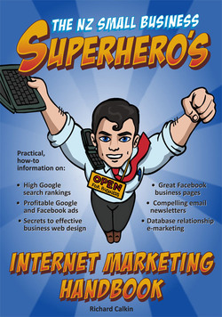
Read the following excerpt from my book ‘The NZ Small Business Superhero’s Marketing Handbook’ and discover how Google Adwords can help increase traffic to your website…
Although your site may look great and have a high visual impact, if it doesn’t immediately answer any questions that your visitor may have, you’ve lost a customer. They’ll be gone – back to the search results where she’ll be looking for another site that addresses her burning questions and helps her find the answers quickly and easily.
This is not to say that your site should look shoddy and amateurish. Of course it shouldn’t. It should make a highly professional impression and should faithfully reflect your business’s visual branding. Nor does it mean that the design of your website is unimportant. Nothing could be further from the truth. In fact its design is absolutely crucial to its success, but you need to understand that it is not about creating pretty pictures!
The true secret to great web design is this: for small business is tounderstand that it is 90% information design, and only 10% graphic design.A website which has the right information (ie answers visitor questions and addresses key information requirements) in the right places (ie adheres to well-researched web usability findings and features highly scannable, skimmable chunks of content), but has poor graphic design will, in most cases, still work. Whereas a website which makes an impressive visual impact but doesn’t provide easy access to the important information will not.
The idea that graphic design is not important. It is crucially important in creating an outstanding website and a skilled, talented graphic designer is a vital member of the team. However graphic design’s proper place in the process is after information design. Once the information design is established, the graphic designer’s brief is to create visually appealing and relevant layouts based on the information design, the target market, and the company’s established colours and visual identity guidelines. There are thousands of books out there on website graphic design, so we don’t go into any more depth.
So having explained that “information design” is the critical success factor, the question now is, how do you achieve great information design? Information design: the right information in the right places. Sounds easy when you say it quickly, and it actually isn’t that difficult when you follow two simple guidelines: 1. The right information: understanding your perfect prospect. 2. The right places: understanding how humans interact with web pages.
If you could read the mind of your ideal customer to find out all her burning problems and key questions, and then use your website to present all the solutions and answers so she finds them quickly and effortlessly, and then make it easy and attractive for her to make an enquiry, would that be an effective website? You bet it would, and that is what excellent information design is all about.
It is important to understand that your website is not for the “general public” as so many websites seem to be. Your website is not for the general public, it is for your perfect prospect! This means you need to build a profile of your perfect prospect before you start building your website. And once you have built up a clear picture of this fictional individual, you will be in a position to figure out their “persuasion requirements”, which is everything they need before they are persuaded they want to buy from your company.
To read more, you can purchase my book ‘The NZ Small Business Superhero’s Internet Marketing Handbook’ by clicking here.

